This week’s write up is a little more personal than our usual topics. I thought it would be interesting to measure my work-life balance over time by plotting my billable hours since I started working. I work for a boutique financial advisory firm that specializes in infrastructure and energy finance. We mainly advise governments so our hours can be a little lighter than other finance professionals, but I remember my hours being pretty brutal when I first started. The last few years have been more reasonable. Let’s see if my time sheets tell the same story.
Tracking billable hours is one of the most tedious aspects of client-based work, as anyone who has had to fill out time sheets can attest. As it happens, I have saved (almost) all of my time sheets since I started working my current job back in April 2009 in Word Document tables. That’s about 79 time sheets.
The source code for the data analysis can be found here.
We can start by plotting weekly billable hours since April 2010, when I started working as a permanent, full-time employee. As shown in Figure 1 below, there is significant variability in my hours from week to week, but the trend appears to suggest a gradual decrease in hours over time. Let’s smooth out the week to week variability by calculating rolling averages.
Figure 1. Weekly Billable Hours
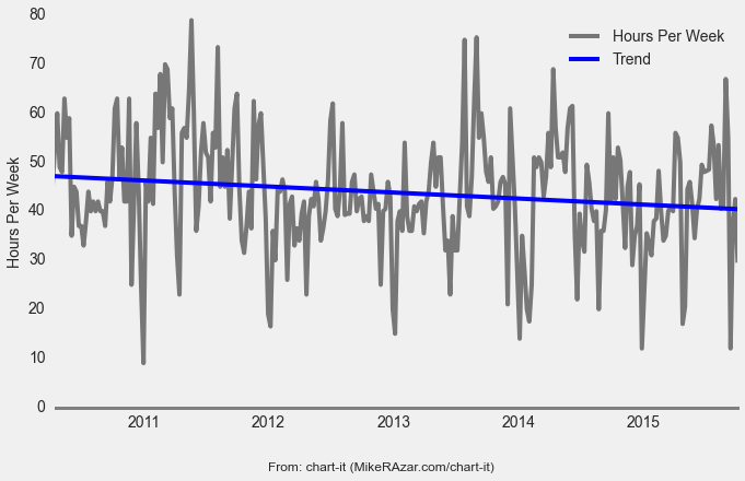
Figure 2. Weekly Billable Hours (Moving Average)
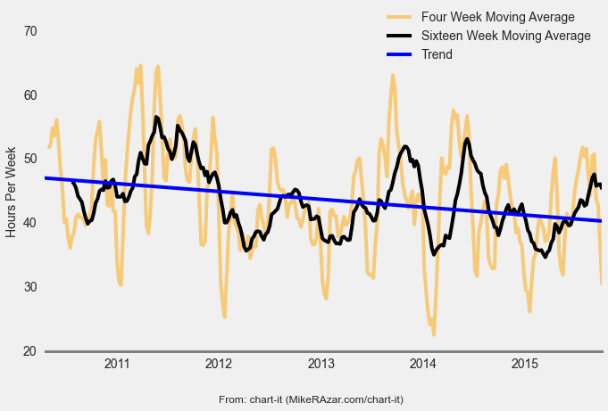
Figure 3 shows a frequency distribution of weekly billable hours along with summary statistics. I bill 43.8 hours per week on average with a standard deviation of 11.8 hours. A quarter of the time, I bill 51 or more hours per week. The busiest week was 79 hours.
Figure 3. Distribution of Weekly Billable Hours
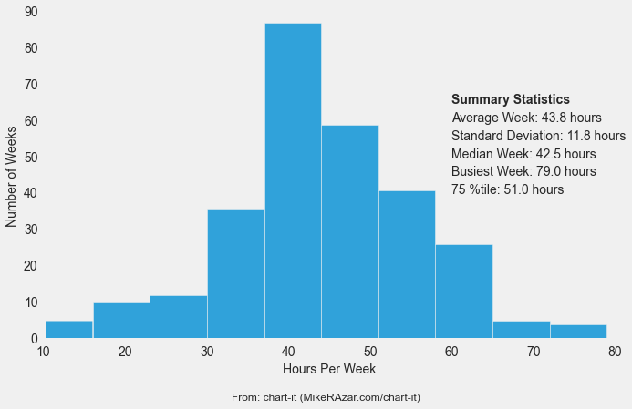
Figure 4. Standard Deviation of Billable Hours (Moving Average)