- Part 1 explores the riding patterns of Bikeshare members in 2014.
- Part 2 looks at bike activity and workload patterns in 2014.
- Part 3 explores popular routes and stations in during the year ending June 2015.
- Part 4 will explore trends over the period from 2010 to the first half of 2015.
The Capital Bikeshare system data can be found here. The source code for the data analysis can be found here (for route patterns) and here (for station patterns).
Routes
First, let’s explore popular routes among Bikeshare users. Route popularity varies by member type as shown in Figure 1 below. Casual riders (mostly tourists), not surprisingly, mostly ride around D.C.’s popular monuments, the Lincoln Memorial, Jefferson Memorial and the Smithsonian/National Mall stations. In fact, casual riders overwhelmingly ride around the monuments, resulting in the top five routes by casual riders actually being the top five routes overall. The most popular route among casual users is from Jefferson Dr & 14th St SW to… Jefferson Dr & 14th St SW (a ride around the National Mall).
Registered riders (i.e., D.C. residents) mostly ride outside of the area around the monuments. Tourists could benefit from observing the popular routes among registered users to explore some of the less well-known parts of D.C. that the locals frequent, including Eastern Market and H St Corridor.
Figure 1. Most Popular Bikeshare Routes
| Casual Riders | Registered Riders |
|---|---|
| Jefferson Dr & 14th St SW to Jefferson Dr & 14th St SW | Columbus Circle / Union Station to 8th & F St NE |
| Lincoln Memorial to Jefferson Memorial | 8th & F St NE to Columbus Circle / Union Station |
| Jefferson Dr & 14th St SW to Lincoln Memorial | Lincoln Park / 13th & E Capitol St NE to Eastern Market Metro / Pennsylvania Ave & 7th St SE |
| Lincoln Memorial to Jefferson Dr & 14th St SW | Eastern Market Metro / Pennsylvania Ave & 7th St SE t Lincoln Park / 13th & East Capitol St NE |
| Smithsonian / Jefferson Dr & 12th St SW to Smithsonian / Jefferson Dr & 12th St SW | New Hampshire Ave & T St NW to Massachusetts Ave & DuPont Circle NW |
The most popular route may also vary by month (Figure 2 below). Interestingly, the most popular route among registered users is the same in every month, except in January, when the reverse route was the most popular. Why are so many people riding from Union Station to the H St Corridor? It may be the result of limited public transportation to the H St Corridor. H St appears to be a big beneficiary of the Bikeshare system.
Among casual riders, the most popular route is always some combination of stations around the National Mall.
Figure 2. Most Popular Route by Month
| Month | Casual Riders | Registered Riders |
|---|---|---|
| July 2014 | Lincoln Memorial to Jefferson Dr & 14th St SW | Columbus Circle / Union Station to 8th & F St NE |
| Aug 2014 | Jefferson Dr & 14th St SW to Jefferson Dr & 14th St SW | Columbus Circle / Union Station to 8th & F St NE |
| Sept 2014 | Jefferson Dr & 14th St SW to Lincoln Memorial | Columbus Circle / Union Station to 8th & F St NE |
| Oct 2014 | Lincoln Memorial to Jefferson Memorial | Columbus Circle / Union Station to 8th & F St NE |
| Nov 2014 | Lincoln Memorial to Jefferson Memorial | Columbus Circle / Union Station to 8th & F St NE |
| Dec 2014 | Lincoln Memorial to Jefferson Dr & 14th St SW | Columbus Circle / Union Station to 8th & F St NE |
| Jan 2015 | Jefferson Dr & 14th St SW to Jefferson Dr & 14th St SW | 8th & F St NE to Columbus Circle / Union Station |
| Feb 2015 | Jefferson Dr & 14th St SW to Jefferson Dr & 14th St SW | Columbus Circle / Union Station to 8th & F St NE |
| Mar 2015 | Jefferson Dr & 14th St SW to Jefferson Dr & 14th St SW | Columbus Circle / Union Station to 8th & F St NE |
| Apr 2015 | Lincoln Memorial to Jefferson Memorial | Columbus Circle / Union Station to 8th & F St NE |
| May 2015 | Lincoln Memorial to Jefferson Memorial | Columbus Circle / Union Station to 8th & F St NE |
| June 2015 | Jefferson Dr & 14th St SW to Jefferson Dr & 14th St SW | Columbus Circle / Union Station to 8th & F St NE |
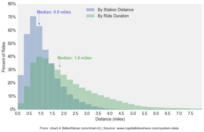
Measuring distance traveled is a little tricky because we don’t know the exact path taken during each ride. Some rides might follow a direct path from point A (starting station) to point B (end station) but others might start and end at the same station with a long ride in between (as we observed earlier). Others might dock their bike to re-start the 30 minute timer before continuing on to their ultimate destination. Nevertheless, we can still roughly estimate ride distance in two ways. We can either calculate the distance between the starting and ending station (using the haversine formula to estimate distance between two latitude/longitude coordinates), or we can divide the duration of each trip (in minutes) by an assumed average bike speed – about 10 miles per hour (compared to 5.9 miles per hour implied by the first method).Figure 3 shows the results under each of these two methods. The average ride is between 0.9 and 1.8 miles, depending on our estimation method. The true average is probably somewhere in that range.
Figure 3. Route Distance
Stations
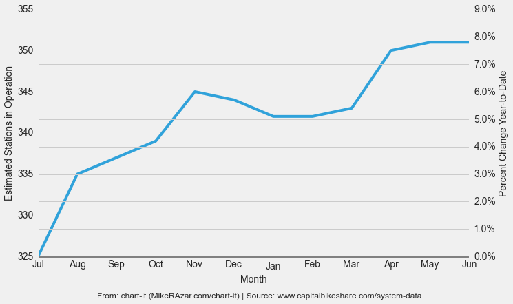
The number of stations increased gradually over the course of the year with November 2014 and April 2015 seeing the largest increase with 10 and six new stations, respectively.
Figure 4. Active Stations by Month
As shown in Figure 5, stations are most densely located between Foggy Bottom, Thomas Circle, Downtown and Chinatown, with scant coverage in certain areas, particularly in the low income neighborhoods east of the Anacostia River. Capital Bikeshare recently announced plans for a major expansion in Washington, DC, partly to service areas with little coverage, but also to better reach casual riders around the National Mall. Most of the new stations are proposed to be built in the area from the National Mall and north to Columbia Heights, with a small to be built proportion east of the Anacostia river.
Figure 5. Station Location Density Map
Figure 6 summarizes the workload distribution across stations based on the number of trips started or ended at that station. The bottom quantile of Bikeshare stations recorded less than 7.2 trips per day during the year. The top quantile recorded more than 80.8 trips per day. We measure station activity using rides per day to adjust for the fact that some stations were not operating during the entire year. It would not be accurate to compare the total number of rides for a station operating for 12 months versus a station operating for just three months.
Figure 6. Summary of Workload by Station
| Statistic | Rides Per Day |
|---|---|
| Minimum: | 0.2 |
| 25th percentile: | 7.2 |
| 50th percentile (median): | 25.1 |
| 75th percentile: | 80.8 |
| Maximum: | 374.2 |
| Standard Deviation | 57.6 |
Let’s take a closer look at the distribution of ride activity by station. Figure 7 shows that half of stations registered less than 25 rides per day, with the remainder spread generally evenly between 25 and 200+ rides. At the extremes, about 15 percent of bike stations logged either less than 3.9 rides or more than 100.9 rides per day in 2014. This demonstrates Bikeshare’s social/political objective to provide a convenient mode of transportation for tourists and locals. A profit maximizing system might avoid many of the low traffic areas. The downside of course is that the system is more expensive as a result.
Figure 7. Distribution of Station Activity

Figure 8. Median Ride Duration by Station
Figure 9. Bike Station Size
| Bike Station Size (# of Docks) |
|
|---|---|
| Minimum: | 7 |
| 25th percentile: | 13 |
| 50th percentile (median): | 15 |
| 75th percentile: | 19 |
| Maximum: | 42 |
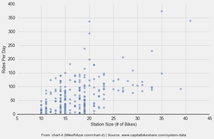
Figure 10. Relationship Between Station Size and Station Activity
One rough way to measure station congestion is to calculate the ratio of ‘rides per day’ to ‘station size’ (the higher the ratio, the more congested the station). Figure 11 below shows this ratio for each station (red means more congested and blue means less congested). Click on a station to see its ratio.
Figure 11. Station Congestion Map
Figure 12 shows the stations with the highest ratio of rides per day to station size. The stations with the highest ratio are generally some of the busiest stations in the entire system and, therefore, most likely to be the targets of bike rebalancing by Bikeshare. As a result, we also show the most congested stations excluding the top 50 busiest stations by total number of rides (which are less likely to benefit from rebalancing). A more accurate way to measure station congestion is to collect real time station data, which can then be used to calculate the percent of the time that a station either has too many bikes or not enough bikes. That is an analysis for a future write-up.
Figure 12. Most Congested Stations
| All Stations | Excluding Top 50 Stations by Total Ride Count |
|---|---|
| Lincoln Memorial | 3rd & D St SE |
| Jefferson Dr & 14th St SW | 4th and East Capitol St NE |
| 15th & P St NW | 24th St & N St NW |
| 25th St & Pennsylvania Ave NW | Eastern Market / 7th St & North Carolina Ave SE |
| 1st & M St NE | 3rd St & Pennsylvania Ave SE |
| 14th & R St NW | 8th & D St NW |
| 20th St & Florida NW | 10th & E St NW |
| Columbus Circle / Union Station | 1st & K St SE |