Visualizing 30 years of airplane accidents (1984-2014) in three interactive dashboards (map, ranking, and time series). All data sourced from http://aviation-safety.net/database/.
Notes:
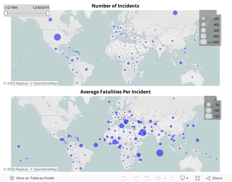
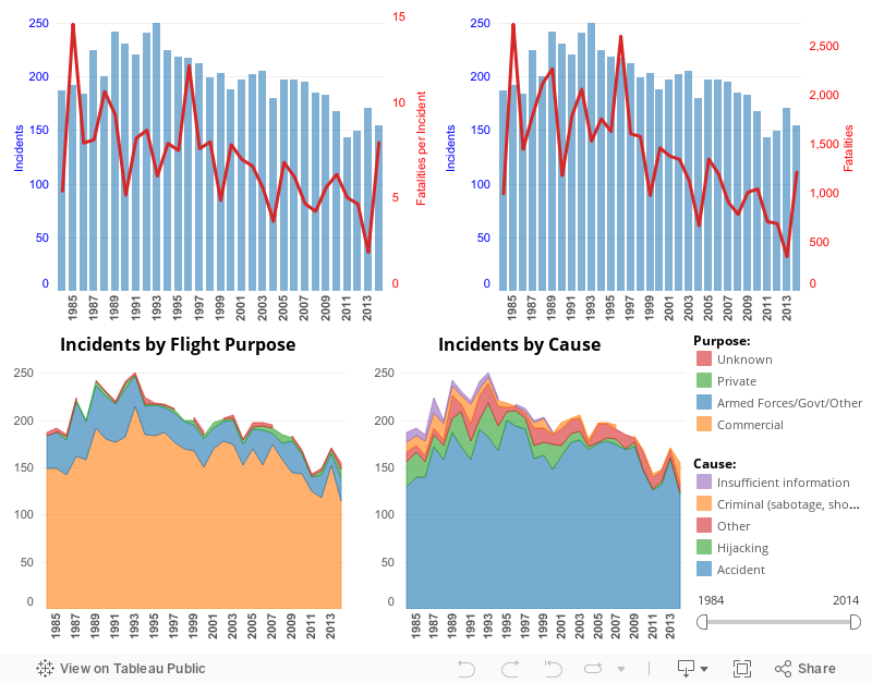
- Ground deaths (i.e., deaths of those who are not passengers or flight crew) are excluded from the fatalities figures.
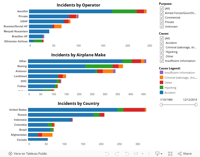
- The figures in the dashboards below are not normalized. For example, the fact that Boeing planes are involved in the most accidents may not mean that Boeing planes are the unsafest, but that there are many more Boeing planes in the air than any other make of airplane. To provide a comparison across time, countries, airplane manufacturer, etc., it is necessary to normalize the data by total number of flight hours or passengers carried, etc.
Mapping Airplane Accidents and Fatality Rates
Ranking Dashboard
Time Series Dashboard
Really informative article post.Really thank you! Much obliged. Marcel